 TerminalNexus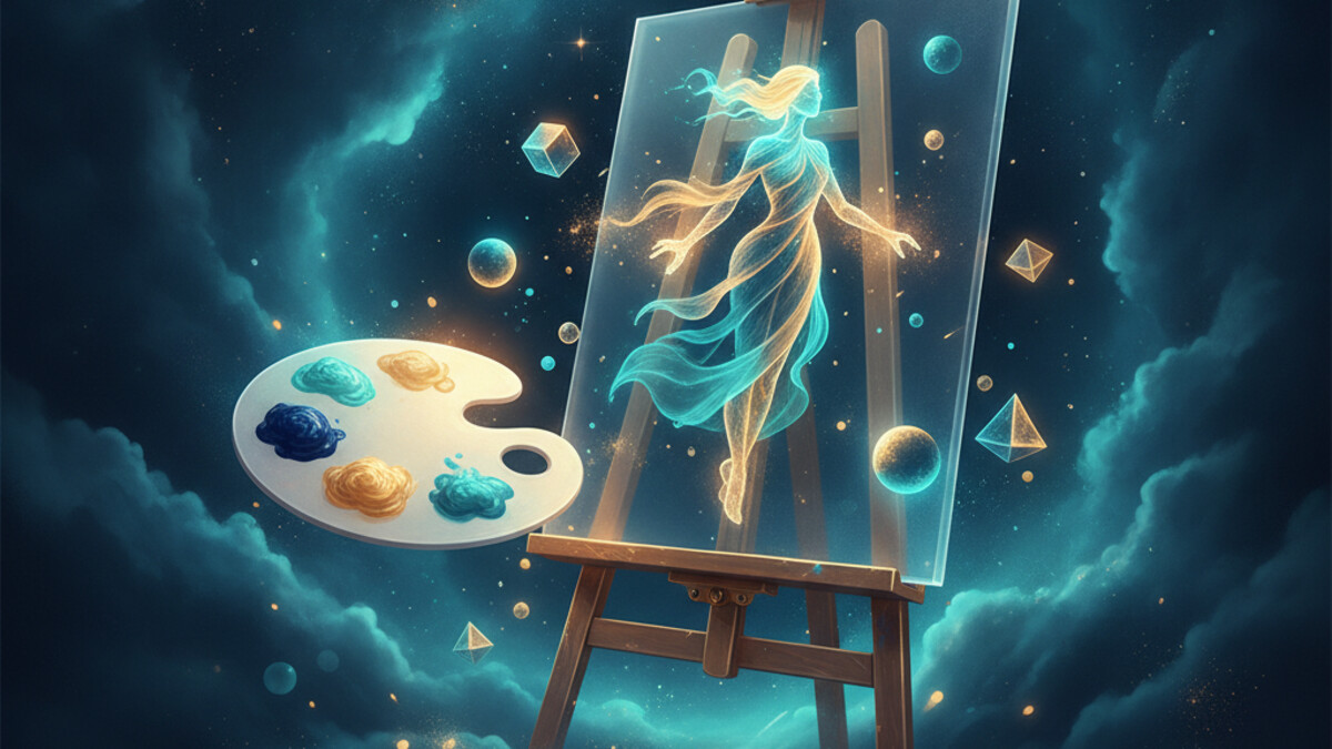
Every post here has a header image, and the one thing I really care about is that they look like a set. Not a pile of random AI pictures. One family: flat, navy and teal, lots of empty space, one idea per image. Pulling a single good image out of a model is easy now. Getting a whole wall of them to look like they came from the same hand is the actual work.
The setup underneath is plain, so I will keep it short. A prompt goes to Nano Banana from my box, the image comes back, and I fix every one to the same 3:2 the blog uses with ImageMagick so nothing sits lopsided in the layout. I set that part up once and have not touched it since. Everything that makes the images look related happens in the prompt.
So the consistency lives in a block of style text that rides along with every prompt, whatever the post is about. It pins the colors to the site's navy and teal, asks for a flat editorial look with plenty of negative space, and says no text, no letters, no logos. That block does not change. The only thing I write fresh each time is the metaphor, one scene that stands in for the idea. The dependency-cutting post got a pair of scissors snipping a cable off an app window. The Git-commands-as-a-menu one got a little menu panel with a cursor on it, next to a terminal. Same world every time, different prop in the middle.
The flat style is doing more than setting a mood. Photoreal images wander all over the place from one run to the next, never the same light or framing twice. A flat, simple style has far fewer ways to come out different, so the set mostly holds together on its own. Picking a look the model can actually repeat does a lot of the work for you.
A few smaller things matter more than they look. I set the final 3:2 in software afterward instead of asking the model for it, because a model told to make something "3:2" gives you back close enough to annoy you and not close enough to use:) I keep the palette wording identical, word for word, from one prompt to the next, since "teal and navy" and "navy and teal" can pull the mood apart. And I usually generate two or three at once and keep whichever one sits best next to the posts already up.
Now, image models have one habit you fight the whole time: they want to scrawl text into everything. Ask for a clean illustration of a dashboard and you get fake labels and gibberish words smeared across it, which looks wrong the instant you see it. The prompt says no text in three different ways, and most of the time it behaves. When it does not, the image goes in the bin and I ask again.
That curation is the other half of the job. I look at every image before it goes up and regenerate the ones that miss. Nothing posts itself here. The model gets me a strong first draft in about a minute, and the call on whether it actually belongs in the set is still mine. A minute and a second look beats an afternoon in a vector editor, and it beats the bland sameness of stock photos.
There is a quieter reason I draw the idea instead of screenshotting the real screen. An illustration has nothing real in it to leak. A screenshot of an actual dashboard can catch an address or a file path in a corner I did not mean to publish. A picture of the concept carries none of that. For someone as twitchy about this as I am, that settles it on its own.
The header on this post came out of the same routine: the style block, a fresh metaphor, a crop, and a final check to make sure it was not lying or scribbling words across itself.
Comments